Here are two recently completed paintings. Both are landscapes, one was commissioned by a collector and the other painting while not a commission, was done for a specific purpose. One is an acrylic and one an oil.
Lets look at the first painting, the acrylic.
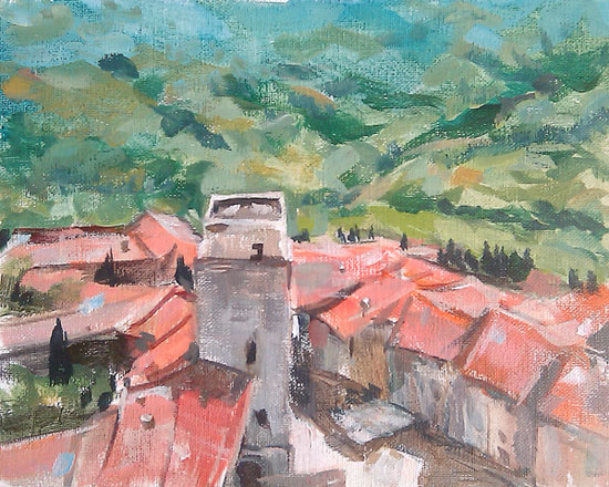
This painting was done to be used as a model for a painting class held in a nearby wine shop, The Twisted Vine. ( You can read about the class
here, and the shop
here.) Since our students use acrylics, so did I. After painting mostly in oils the last five years or so, but having painted watercolor portraits for over ten years before, the acrylics were interesting to work with. The first layers started out very transparent, like watercolors, on a white canvas. Later opaque passages were worked in. New colors to learn such as the difference between lightening a color by diluting it and letting the white show through and lightening a color by adding white. A good example of this is burnt sienna. You can try this with oils or acrylics.
And then you have to decide when to go opaque and when to leave transparent passages alone. And this was supposed to be easy, to provide a guide for students....
The second painting is an oil, a painting of a golf course. However, it is not your ordinary golf course.
The painting is 12 x 24 on oil primed linen. A transparent ground of Charvin French red was applied (Why do French paint companies come up with such names. Why not use the pigment names so we know what we get. Cadmium Red, Cad. Red Light, Cad. Red Deep. Make it a little easier for us easily confused artists) The French Red has a very orange cast to it when applied in a thin layer. Then comes the nice soft buttery oil paint with enough pigment load to actually be opaque. Except, the oil primed linen has a very slick surface compared to an acrylic ground. So a first layer was blocked in rather transparently. Once paint was on the surface, your brush would remove paint rather than blend it. So plan your work. Get the color right and get the shapes right.
After it had a chance to set up and dry somewhat, the surface was more receptive and would grab the paint. Overpainting and blending became possible. Like the acrylic, I had to decide what to leave as is and what to paint over. (The answer is that most of the painting was overpainted, however a lot was left from the original session. Most of the area above the grass. The shadows of the hills were let mostly alone. The dark shadows in the sand traps also. The sky was painted over three times, using the grain of the canvas to let some previous colors come through.
A fun to paint painting. It's always great when a painting works out and you get to enjoy creating it.